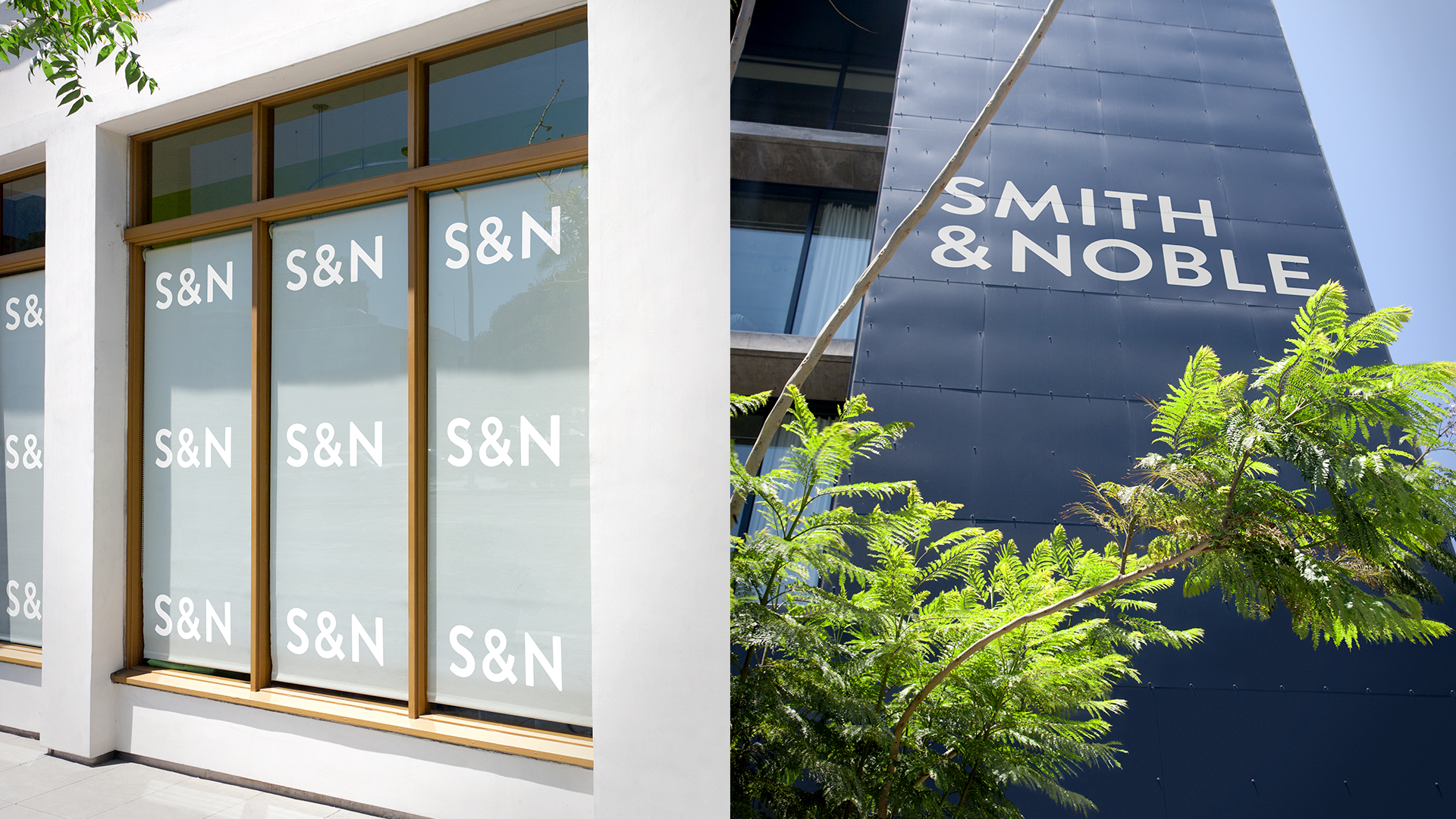
Smith & Noble
One of the largest custom window treatment makers in the U.S. since 1987, Smith & Noble had not updated their branding since the ’90’s, and it was showing. They needed an updated visual system to communicate their commitment to premium customer service, safety, and style — something their previous branding was not capturing. Their DIY business model means they need to communicate the shopping experience and process effectively, without overwhelming the customer. The brand needed to be inspirational, accessible, and trusted to interior designers and homeowners alike.
We gave Smith & Noble a new, modern logo and a visual system that instills confidence, inspiration, and trust within customers. The new brand now communicates premium service; paying attention to meticulous detail while an easy to navigate user experience and friendly, feminine tone of voice assures customers they can get the support and inspiration they need to make their purchase confidently. From designing their printed catalog to ‘how-to’ videos, we’ve made the custom window treatment experience seamless and inspiring.
Produced By:
Ferroconcrete
Client: Smith & Noble
Creative Direction: Yo Santosa
Brand Direction: Scott Meisse
Art Direction: Mike Payne
Design: Mike Payne, Cindy Mai, Sunjoo Kim


