


Hatch
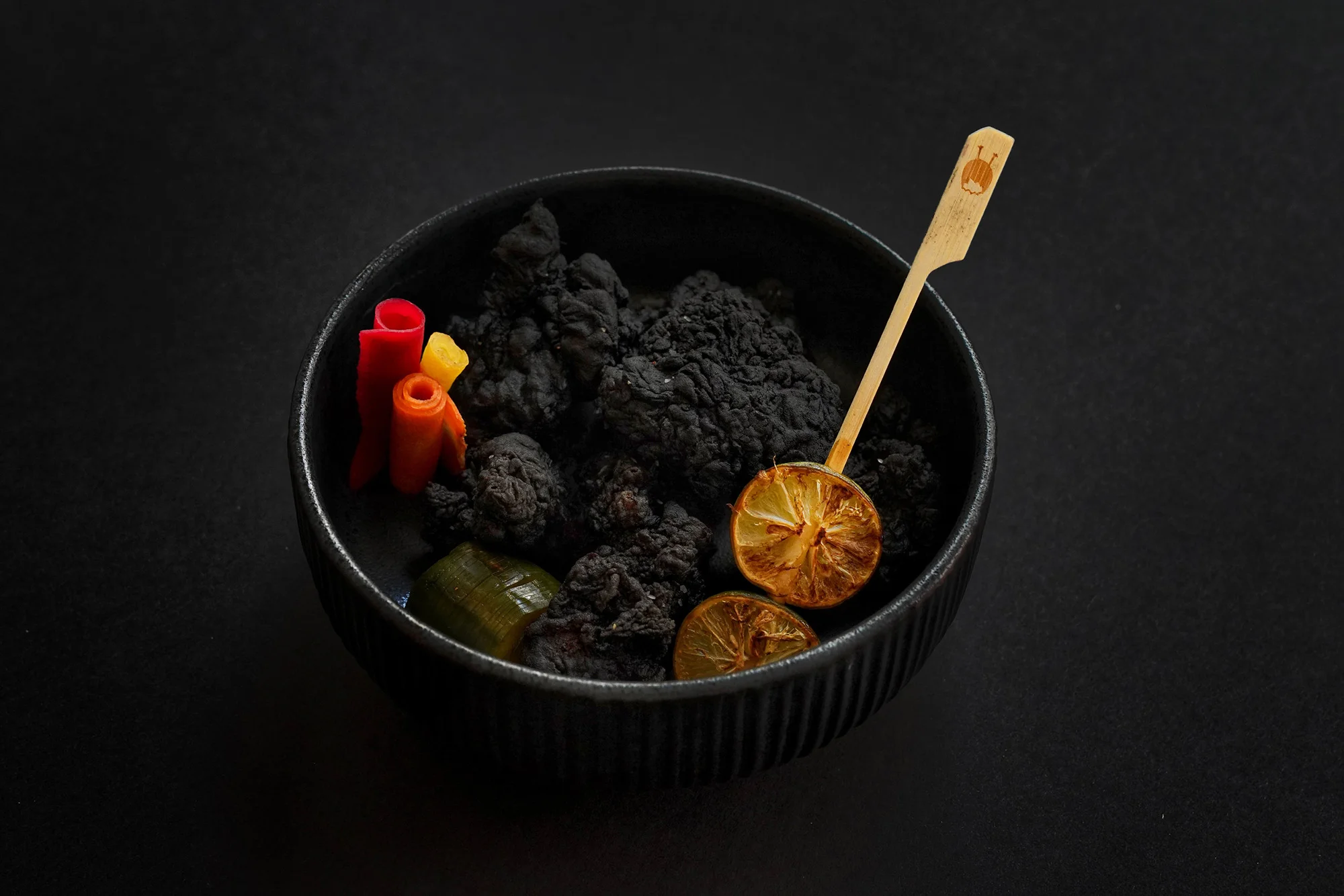
Opening a new restaurant is a daunting task, but once the dust settles the largest challenge is standing out from the crowd of the city's hottest chefs and upstart trends. Hatch — a new yakitori restaurant and bar in the heart of Downtown LA — wanted to fuse its traditional Japanese roots with a more accessible brand that resonates with a modern American audience. Like their menu, the brand needed to break from tradition and be brimming with personality and flavor.
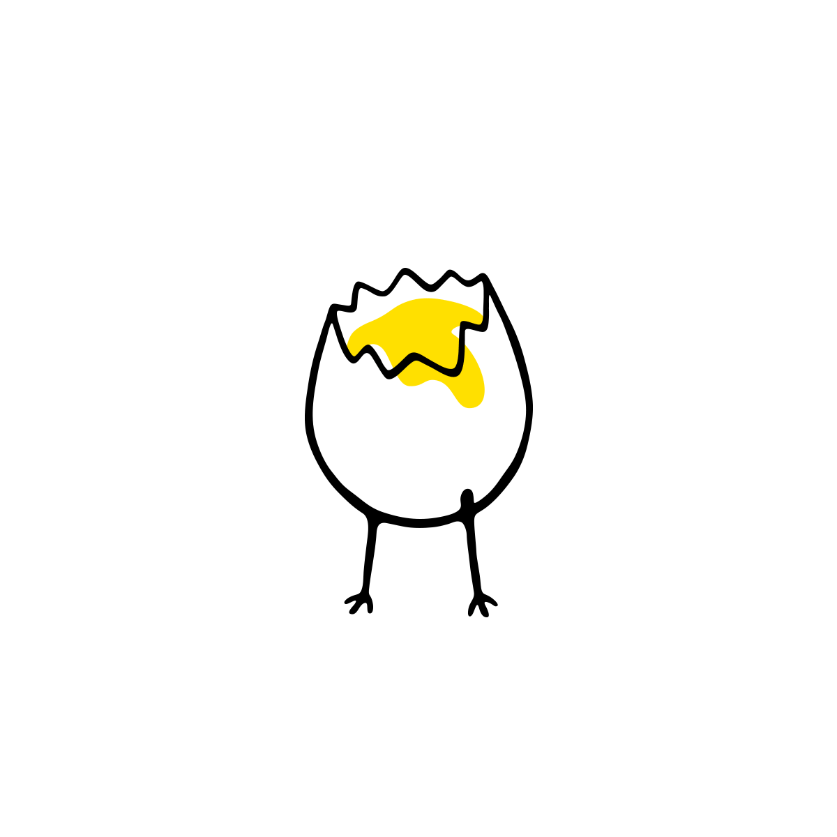
The Hatch team wanted us to create a system based off of their original sketches of eggs, while merging a familiar Japanese style with a raw, cartoon aesthetic. We built the logo and type system to compliment the rough, ink-drawn look of the mascots; a bold and clear logo that stands atop the identity system without clashing or interfering. The typography is simple, but carries the brand’s personality in short, sly bursts of character with a quiet nod to haiku through cheeky mascots.
Client: Hatch Yakitori + Bar
Creative Direction: Mike Payne
Illustration: Mike Payne