


AIGA LA
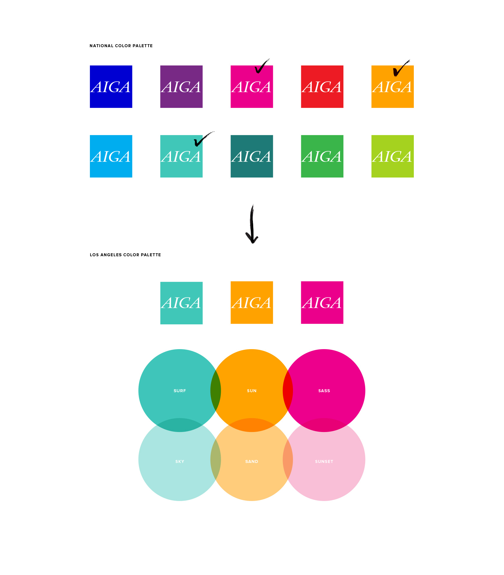
After a nation-wide rebrand of AIGA, the LA chapter was looking for a way to differentiate itself from the chapters of other major cities, while simultaneously respecting the confines of the parent brand system.
Using a bespoke selection of their colors and typefaces, we distilled the new AIGA system down into a few key elements that set AIGA LA apart in personality and tone, as well as gave their team a cohesive toolkit to use throughout their marketing and outreach.
Produced By:
Ferroconcrete
Client: AIGA LA
Creative Direction: Yo Santosa
Brand Direction: Scott Meisse
Art Direction, Design & Copy: Mike Payne